Ipsos UX research tool used by brands like Lloyds, Amazon, and Visa


Executive summary
Traditional PDF reports were being created but rarely referenced, resulting in wasted insights and duplicated research efforts. Visa and Ipsos needed a new way to engage stakeholders with their research.
Role
Working closely with a Visa design and UX director and the Ipsos UXR team:
Transformed complex research data into strategic, actionable insight "nuggets"
Used data visualisation and charting to support insights
Turned PDFs into engaging digital tool
Impact
Widely loved by their clients, Ipsos adopted the tool as a business development asset with companies including Visa, Lloyds, Meta, Amazon, and Open Banking.
Accelerated decision-making through easily accessible insights
Strengthened research influence on product strategy and roadmap prioritisation
Scope
Prototyping
UI
Branding
Conversion optimisation
Strategy
Design systems
Product design
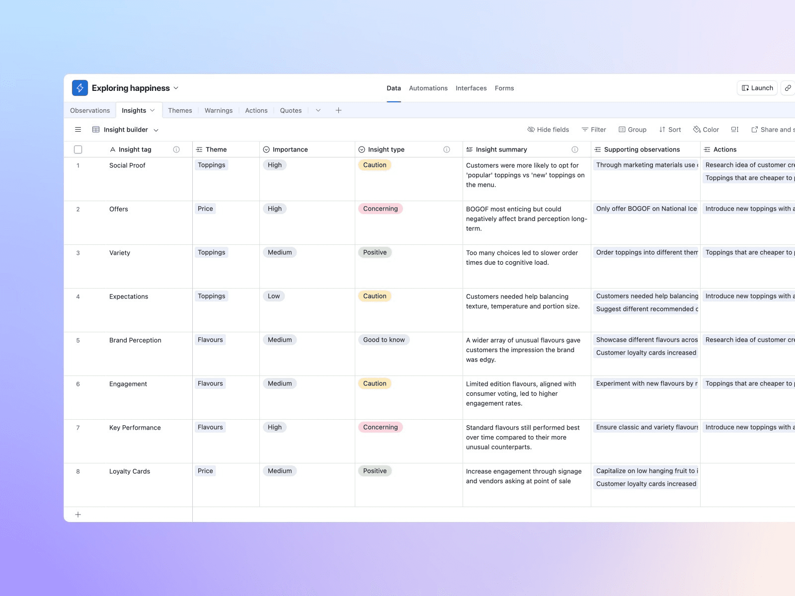
Using Airtable to capture data in real-time
Replacing sticky notes with an Airtable database gave us a consistent source of input.
(sensitive material neutralised for this case study)
Insights to action
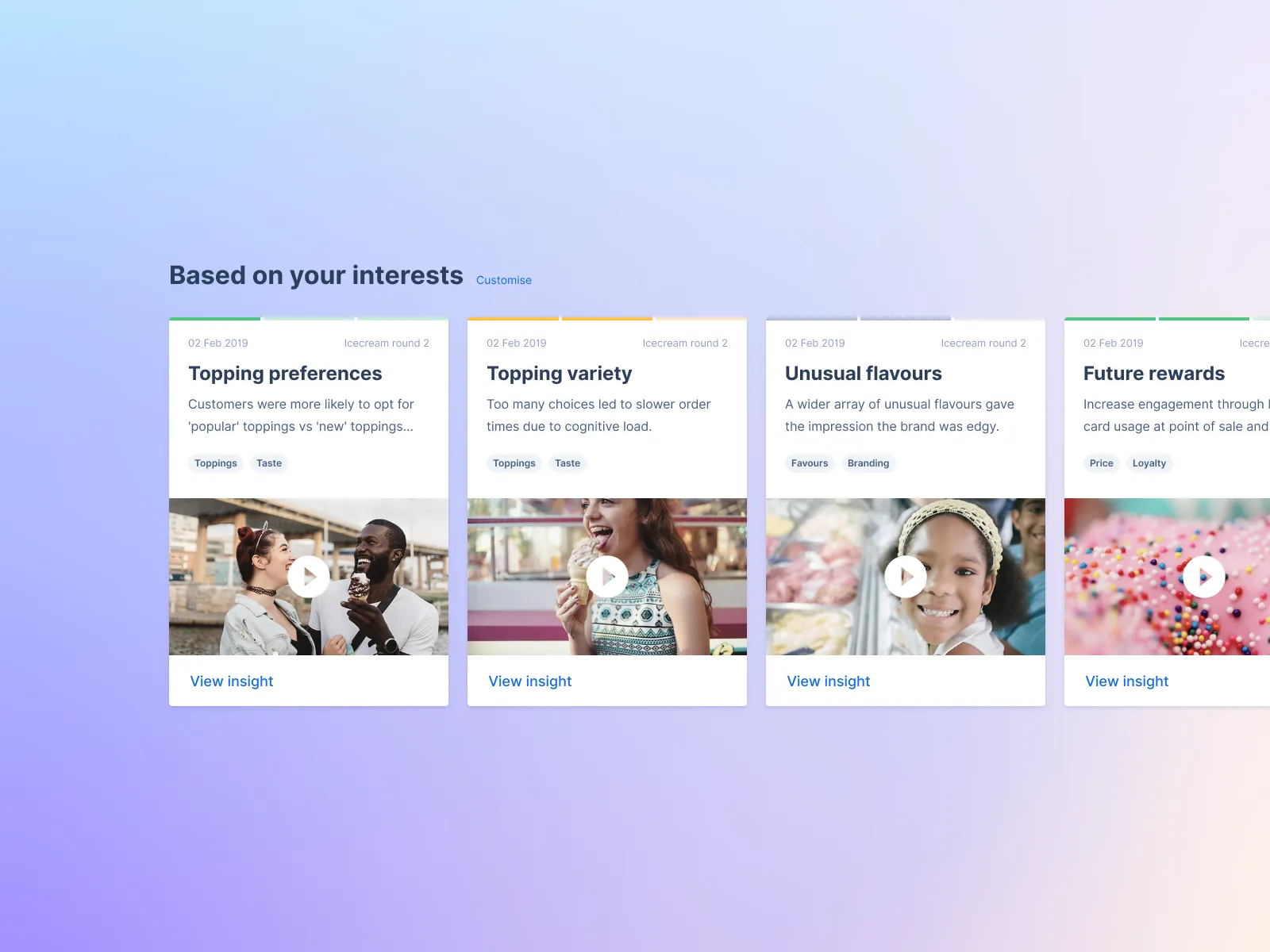
Each research-driven insight nugget is formatted into a themed card along with a key action. Each insight is linked back to verbatim observations for robust data-driven research integrity.
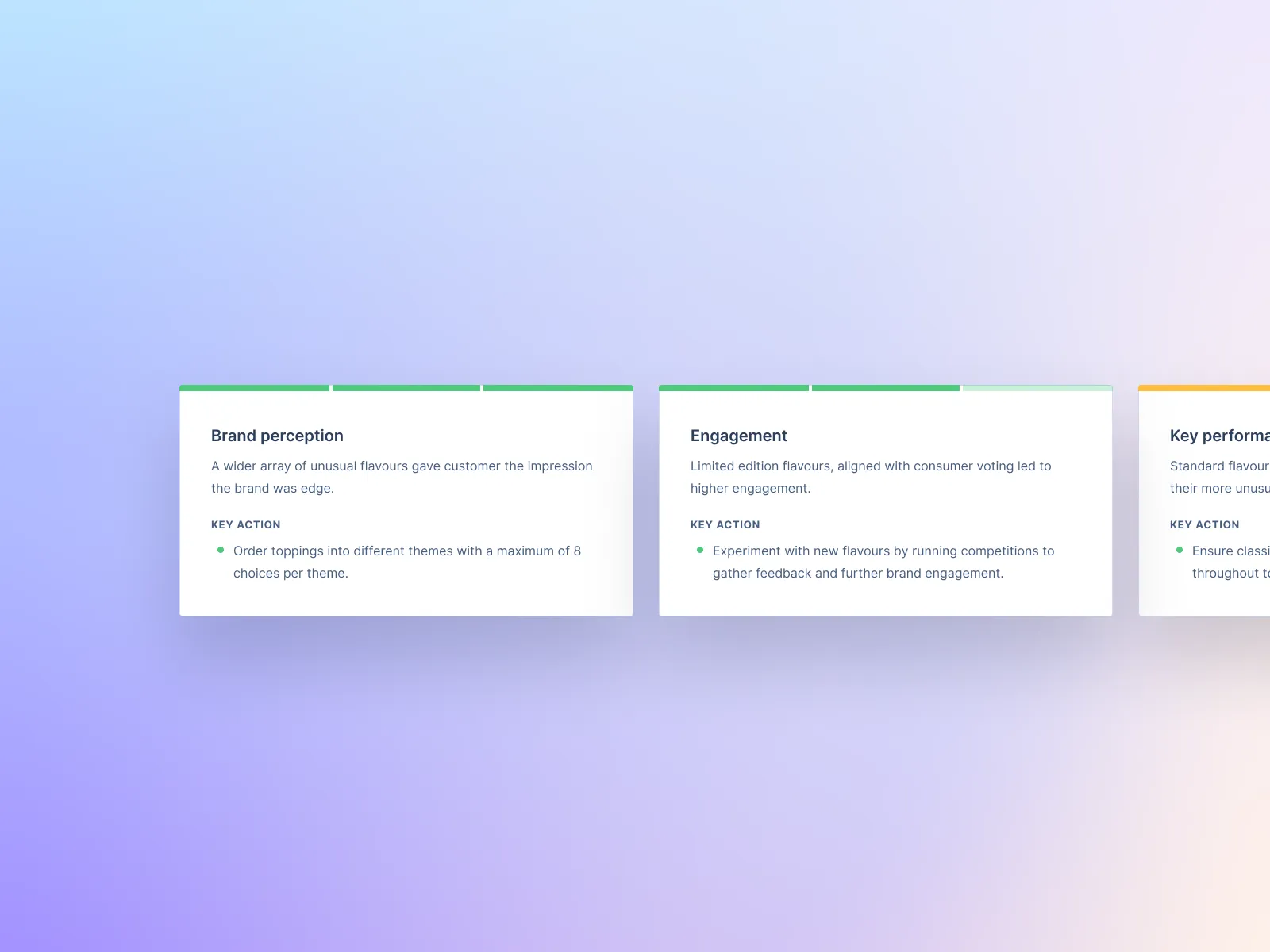
Keep it scannable for C-Suite
Insight cards are grouped into themes that form a top line for C-suite and casual readers, who don't need every detail but want to see the value of the research.

Provide depth with data
By clicking on an insight card and users get the 'Insight Board' which includes more granular detail, including quant, qual, and customer quotes.

Data visualisation beats tables
Quant data backs up qual data. Previously, research was presented in tables, which made it harder to see patterns. Instead, a set of charts replaces less engaging tables. Specific data required specific charts to provide the most clarity.

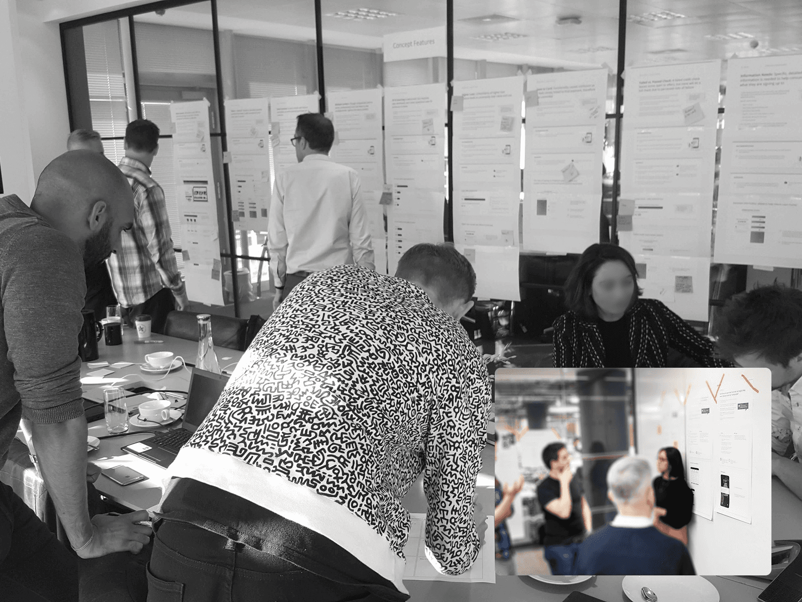
Encourage in-person collaboration
The insight boards work in both digital and print formats, so they are routinely printed to facilitate ideation and help teams make informed decisions.
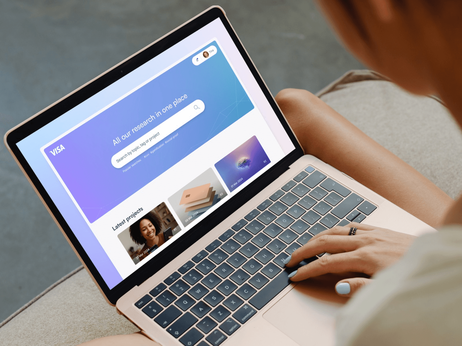
The vision
The goal is to unite all research in one place, with easy ways to search existing insights, making research accessible, useful, and actionable.
Using personalisation to increase engagement
Different people wanted to see different things, so we personalised based on reading habits and early onboarding signals.
Evolving with AI
As AI tech improved, our next goal is to bring in the concept of 'chatting' to your research.