Co-creating the UX standard behind every card payment on the planet
Executive summary
Working with Ipsos' UXR team and EMV 3DS teams to validate and improve the payment authentication flows used by every bank, card network, and merchant.
When you buy online, for each purchase you’ll be shown one of ~12 flows to make sure the purchase is legitimate. This happens in milliseconds, sometimes you won't even notice it.
My role
• Design and prototype around 80 payment flow variants across 6 international markets
• Conduct rapid design iteration during user testing to improve copy, UI, and overall UX
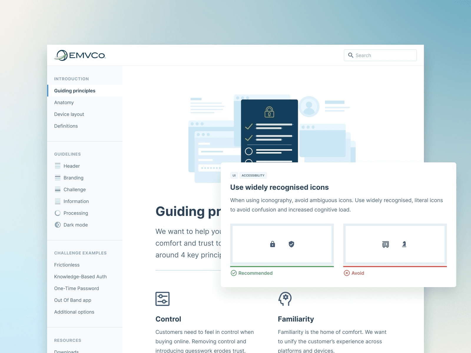
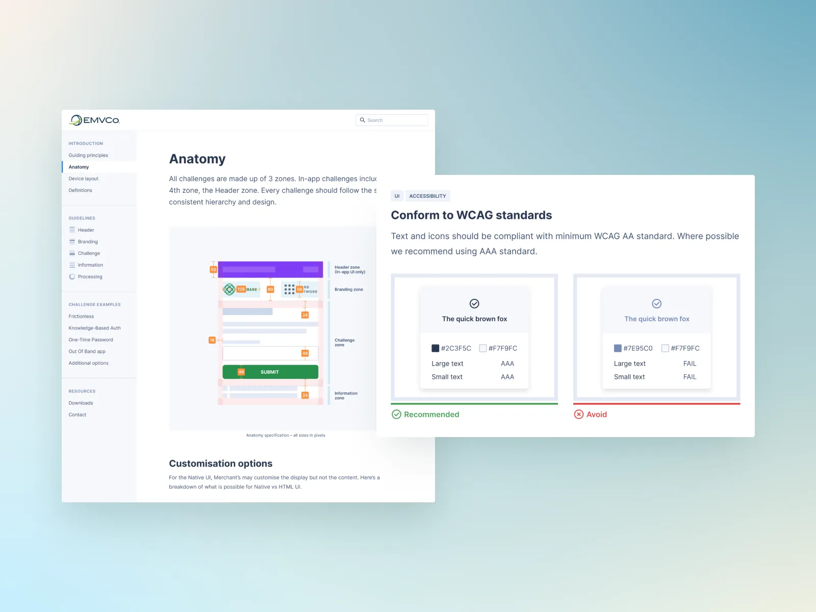
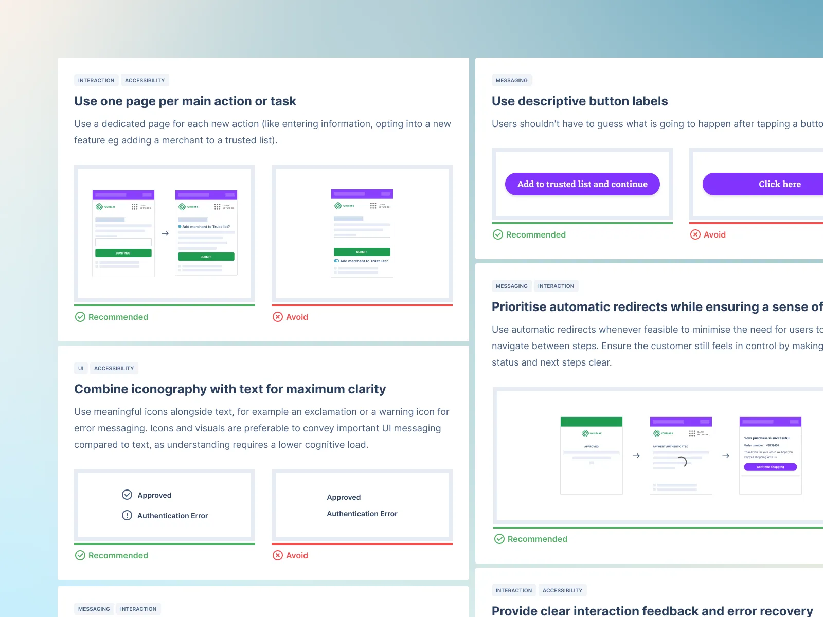
• Create an interactive UX guidelines product
Impact
Reduced authentication friction points that cause checkout abandonment
Validated the best design approach for each new and existing flow
Created UX guidelines website enabling consistent implementation
Scope
Prototyping
UI
Branding
Conversion optimisation
Strategy
Design systems
Product design
Three parties are involved when you buy online
Each party as different priorities; the merchant wants maximum conversions. The banks want maximum security. The card networks want a bit of both (and you want your coffee machine ASAP).
EMVCo manage the tension between these parties
In our first collaborative workshop we co-created each and every flow variant, including new features and UX enhancements, fringe and unhappy flows. Visual journey maps helped bring alignment quickly.
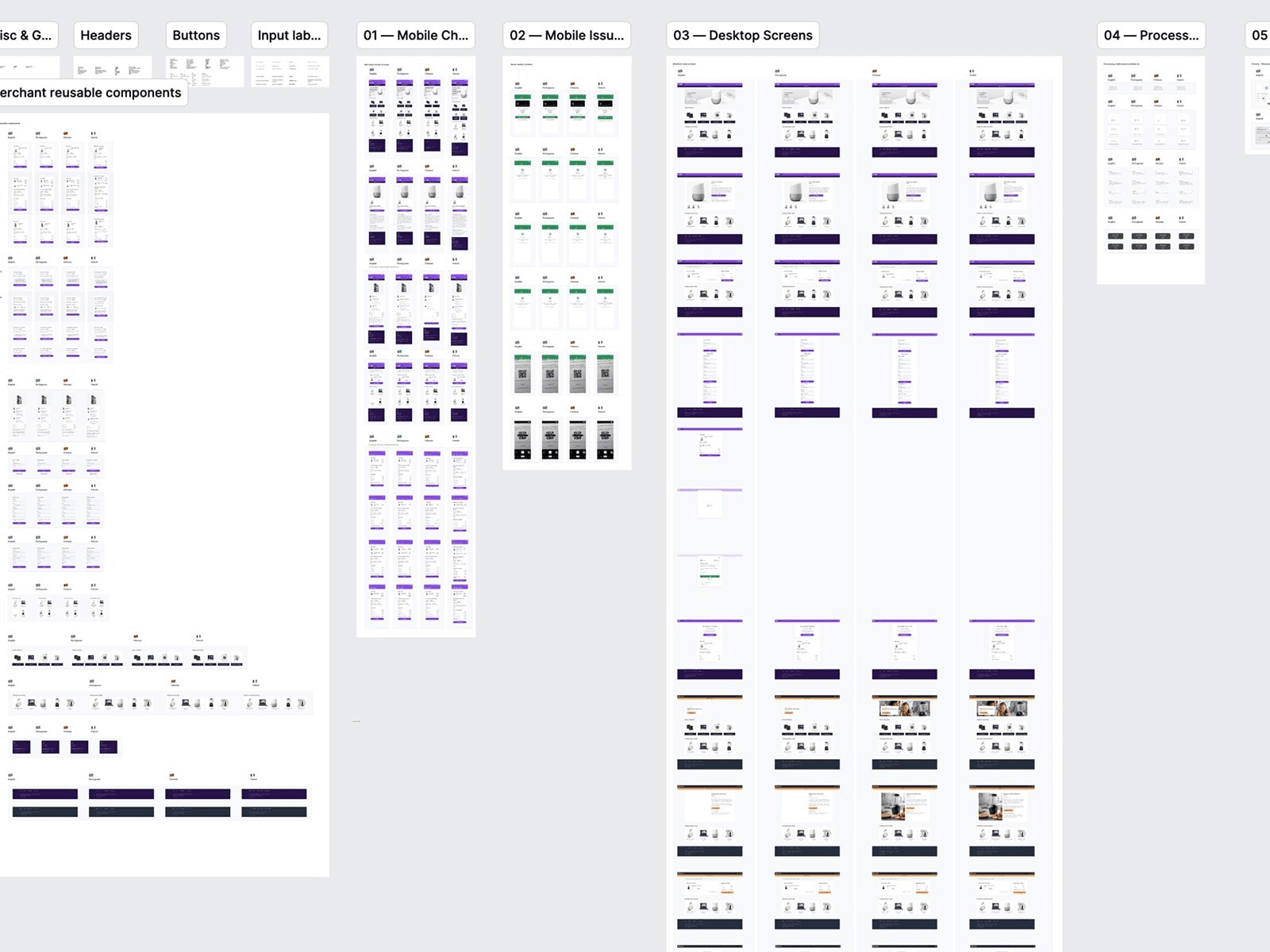
Building a robust, multi-lingual design system in Figma
Each screen and each flow, with versioning and components, make iteration during testing easier. We had to work closely with the Figma team to address performance issues.
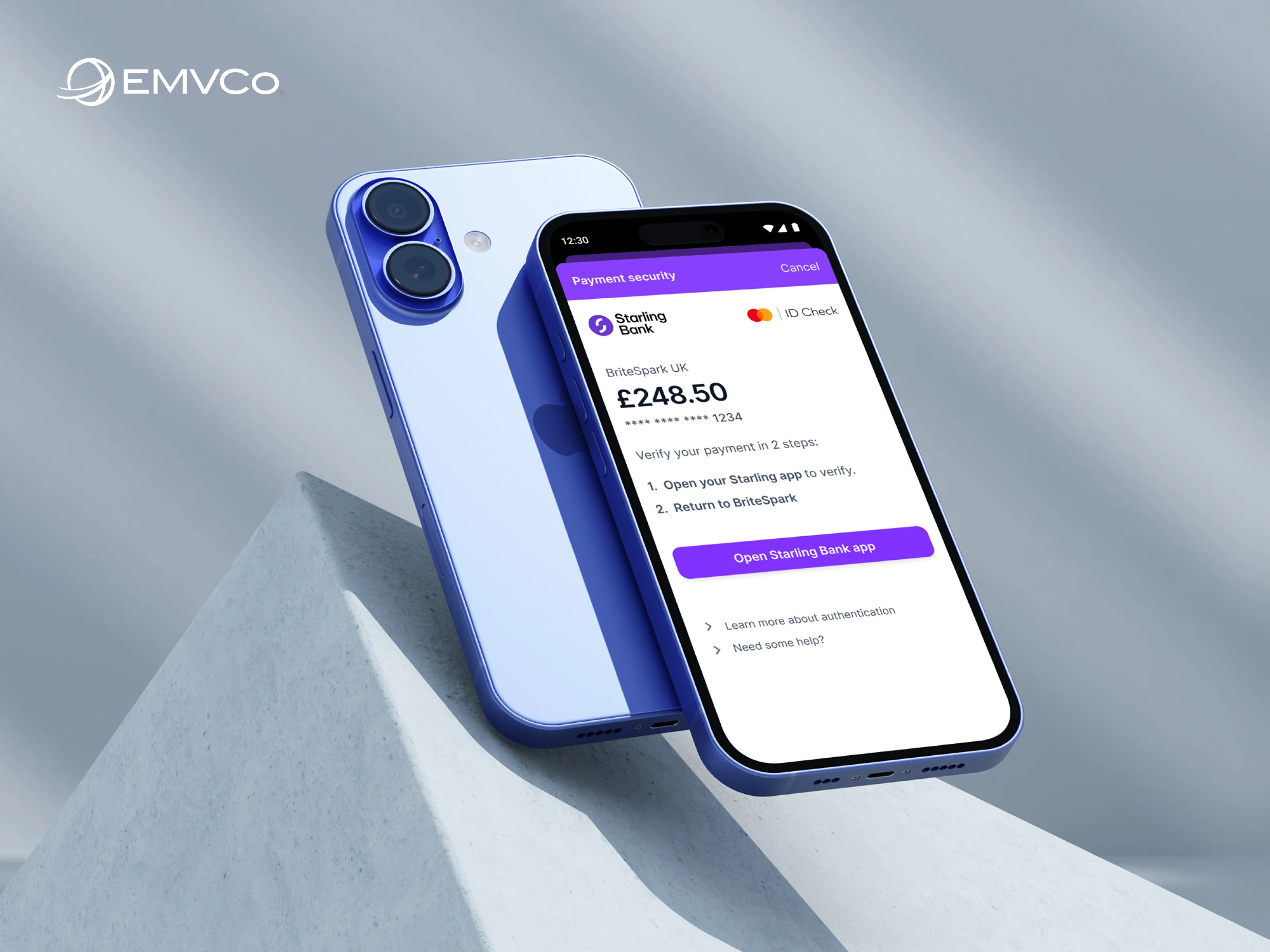
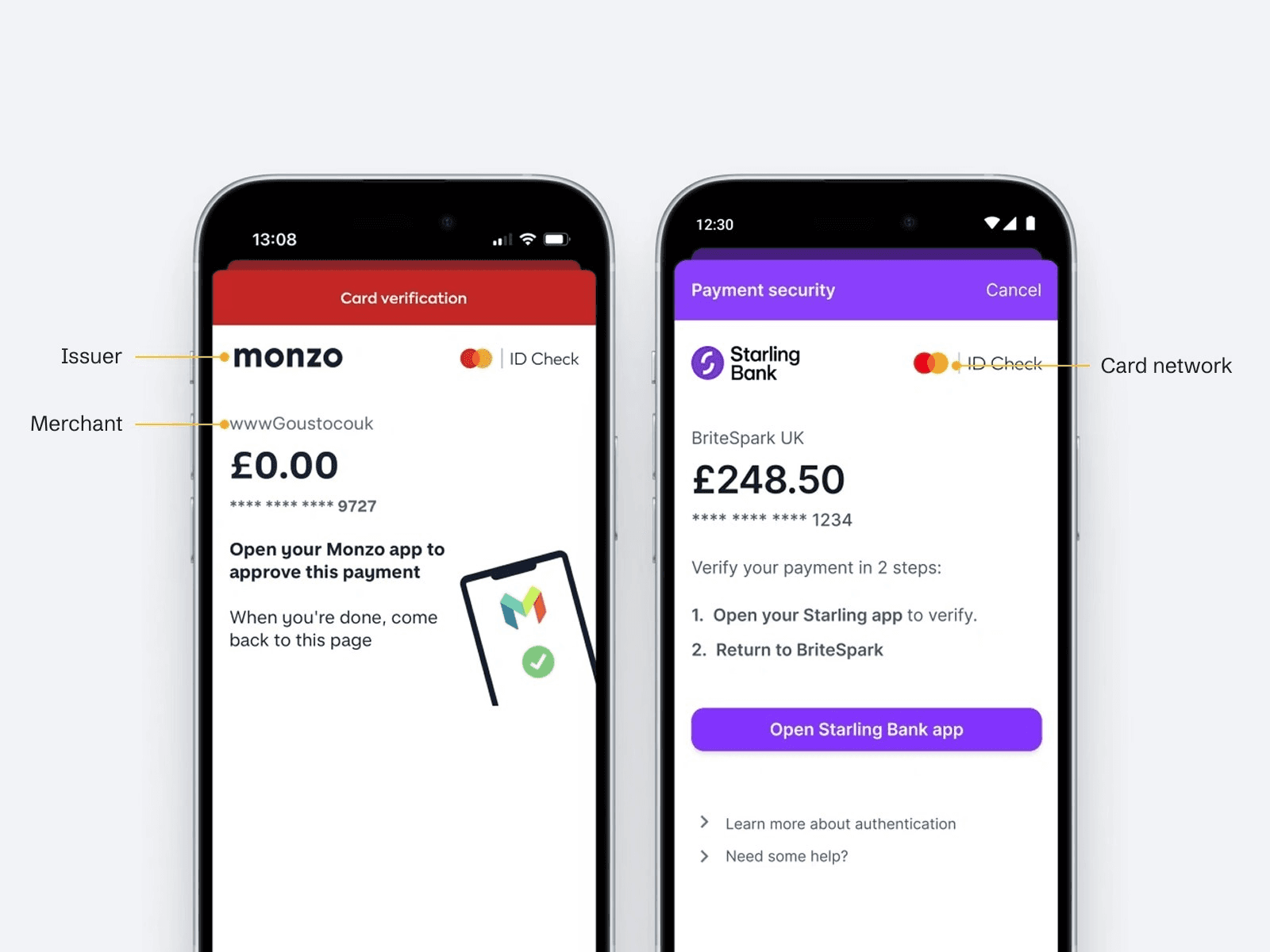
Testing with brands people recognise gives false results
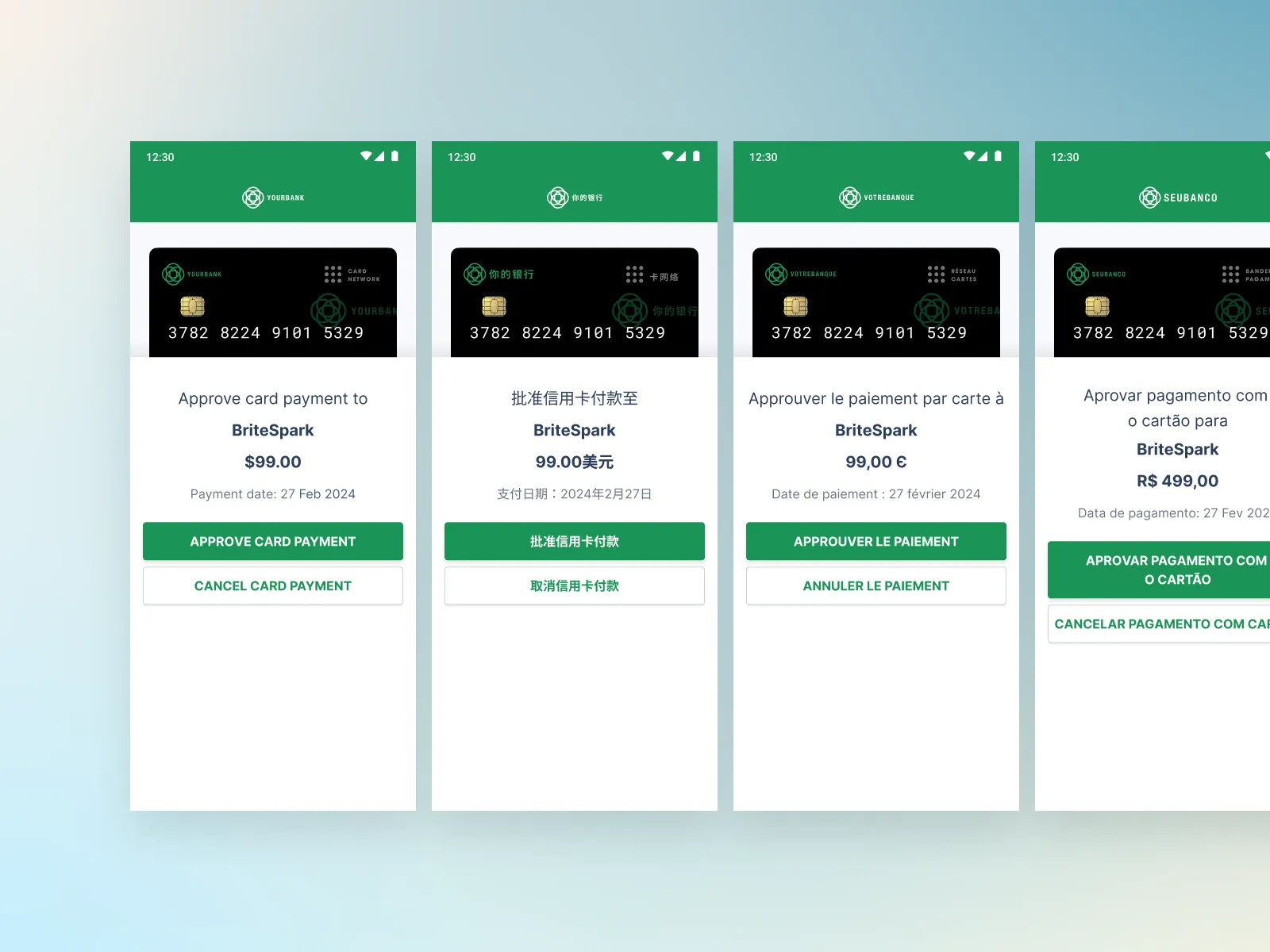
As soon as people saw their bank or card network logo, they felt more at ease. To simulate more realistic payment anxiety, we made up fake brands for each card network, bank and merchant.

Every flow had to be translated for each market
We combined AI with local translators in each market. This was done with a combination of Google Sheets, components, and a Figma translation plugin.
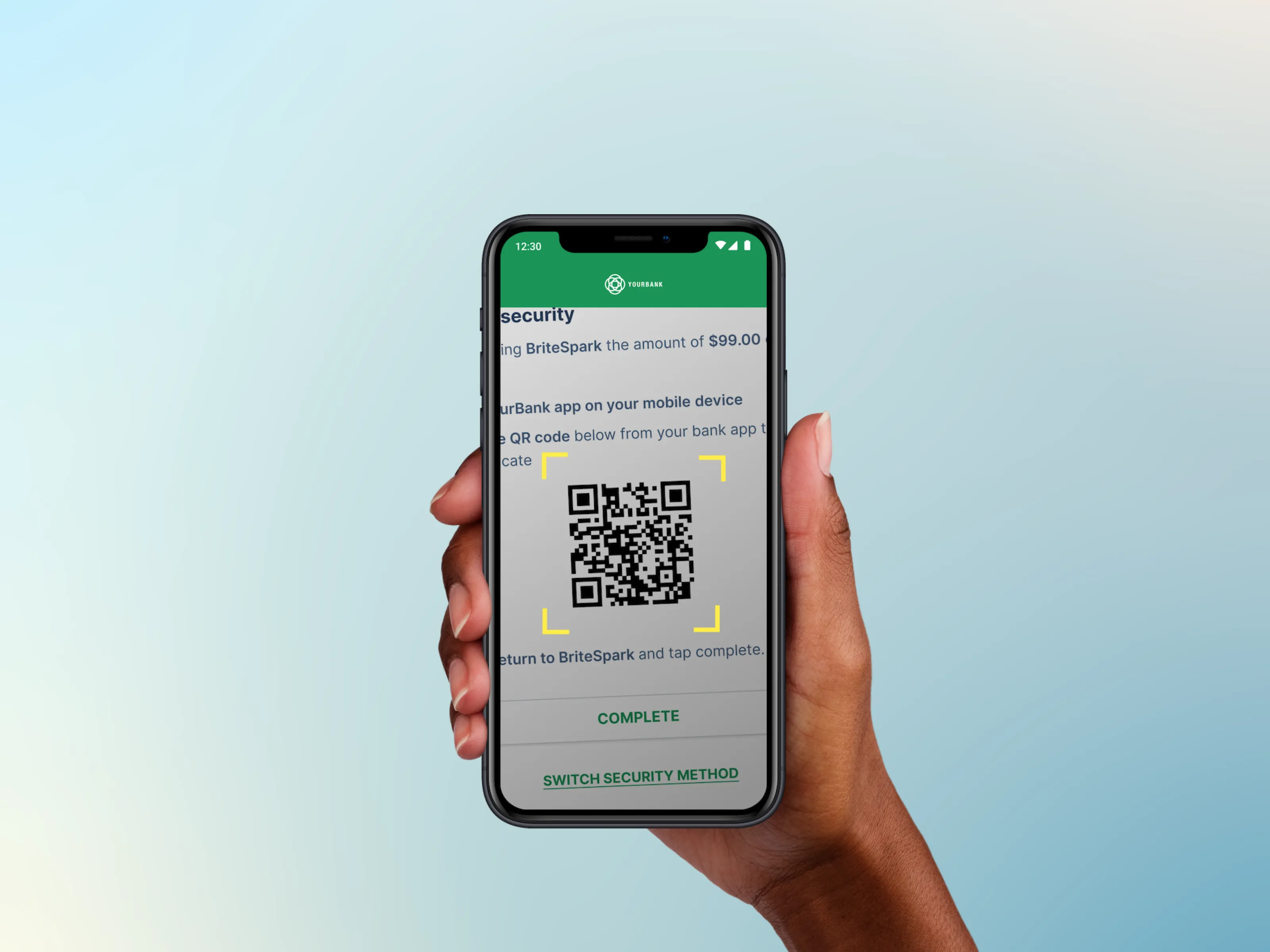
We simulated new security tech for each payment flow
As new tech (like QR) evolved on both smart phones and browsers we had to pivot and update flows to accommodate the changes.
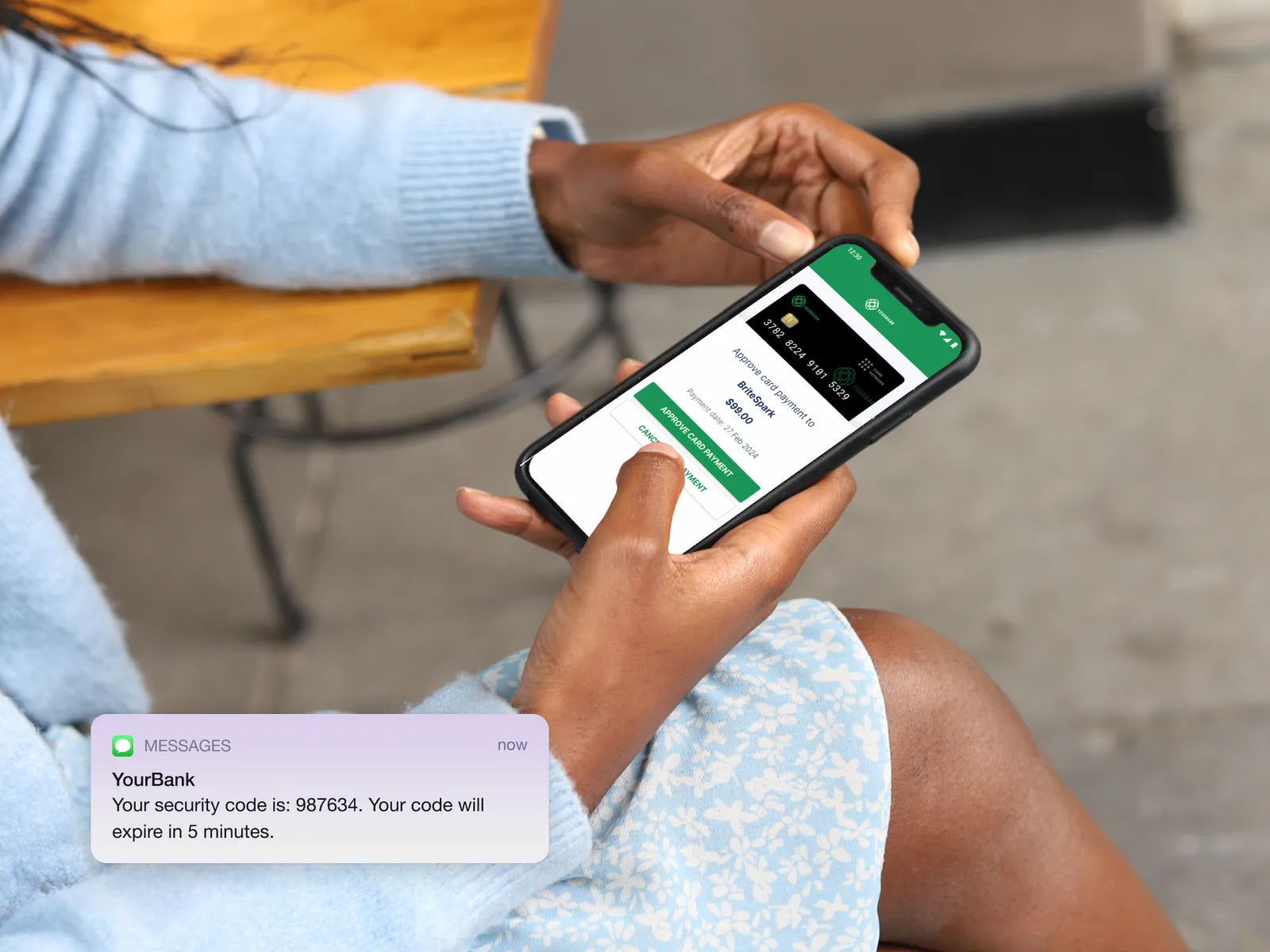
Every notification's UX copy was tested
Front-loading key details is key to efficient purchases and reducing drop-offs.
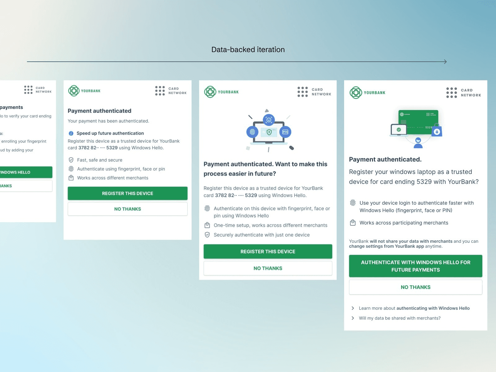
Data-backed iteration
We used data-backed iteration to maximise clarity and comprehension of new anti-fraud technology and approaches.
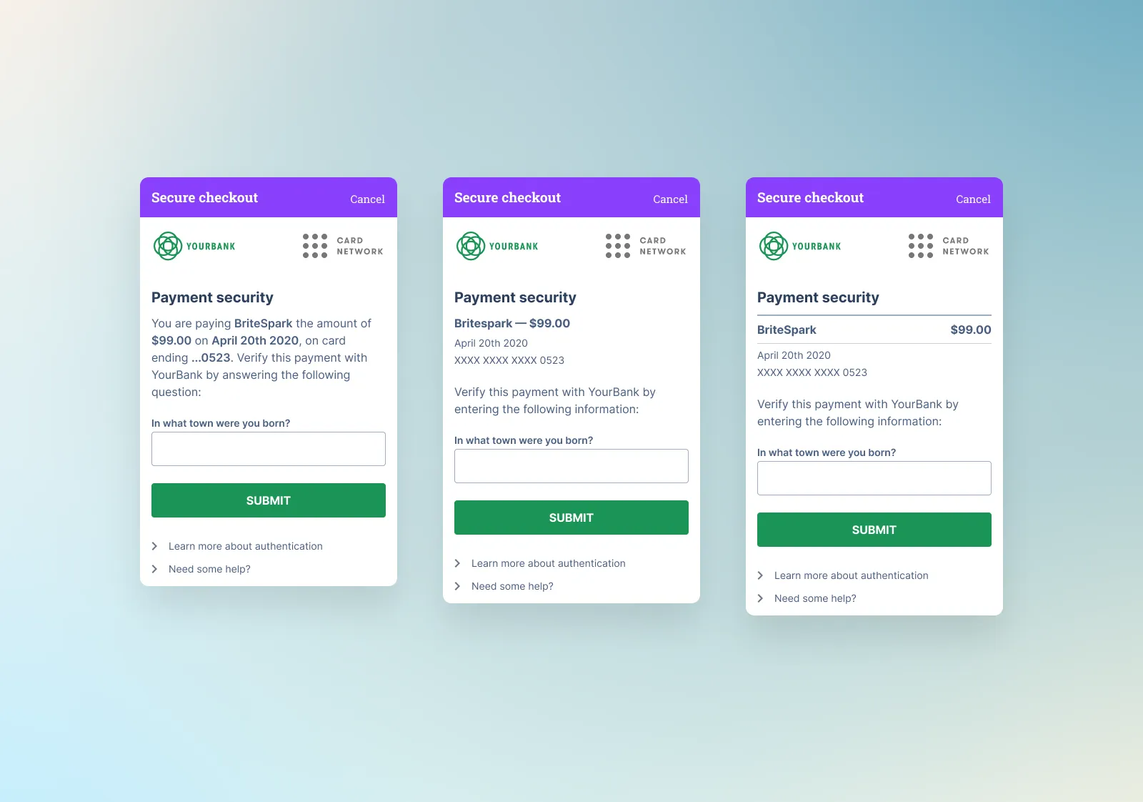
We tested different challenge layouts
A big challenge was constraints. Many layouts were just not possible and any changes had to also work for every language.
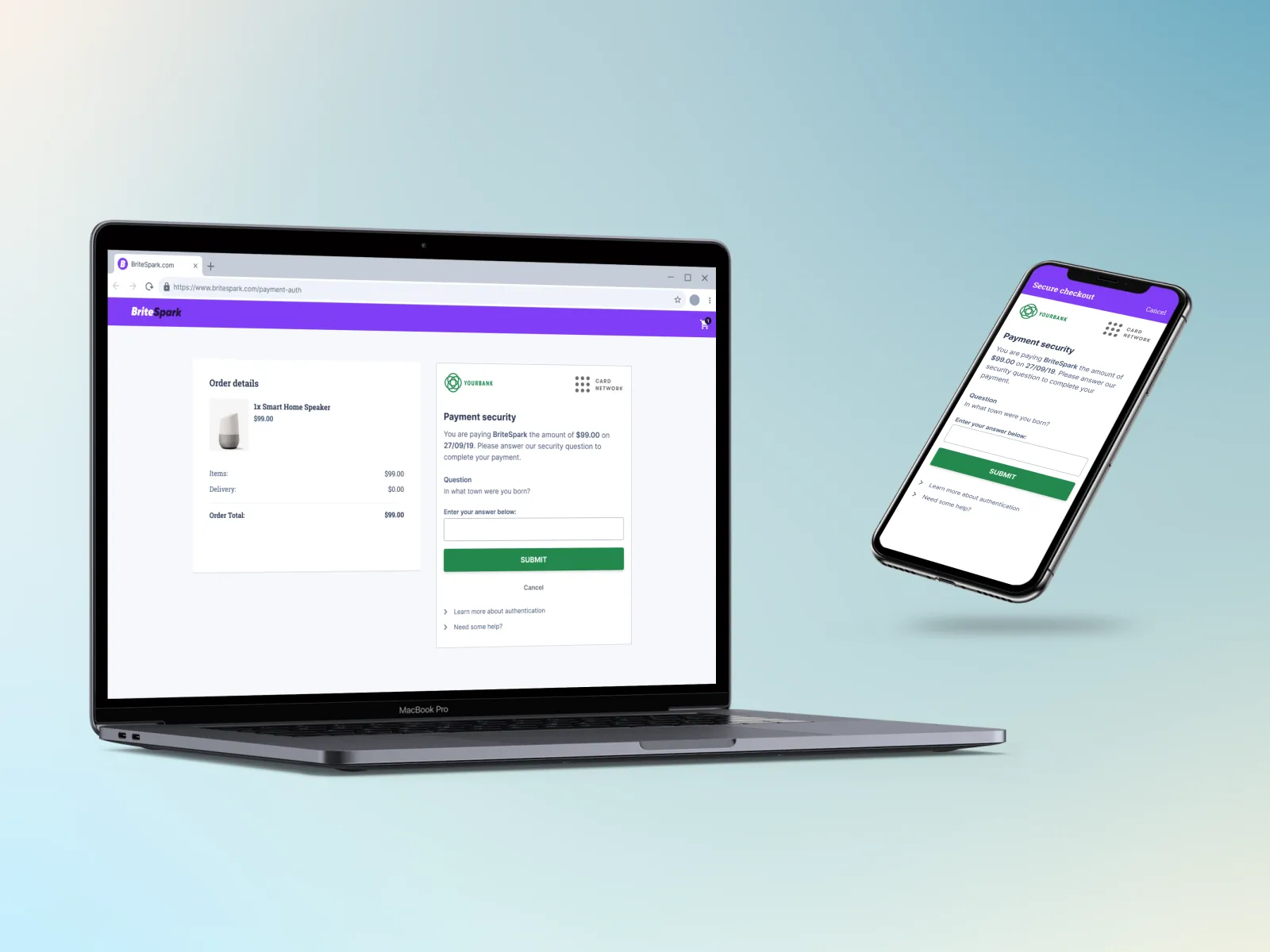
From phones to game consoles to desktops, the challenge template had to remain consistent
Research suggested any inconsistency can trigger hesitation and at this scale, costly abandonments.
The smallest UX copy can make or break a conversion, especially during unhappy paths
Imagine something breaking midway through a big purchase, you need to feel at ease and get clear instructions. We tested and iterated all copy to maximise clarity and trust using Figma variables to manage the lexicon.

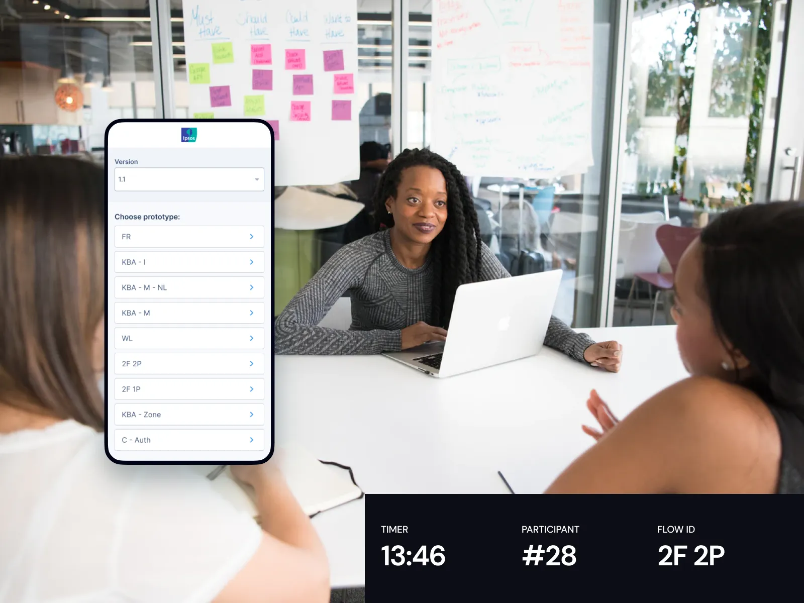
80 flows in 6 markets is hard to manage
Each researcher needed easy access to each flow, in each international market. So we built a flow variant hub. We also included things like secret hit spots to reset each prototype.
We often iterated live and used Figjam to capture key findings and changes
We captured every design change in Figjam and ported all insights across to Airtable to share with the wider teams. We used coloured sticky notes to make insights scannable in Figjam.
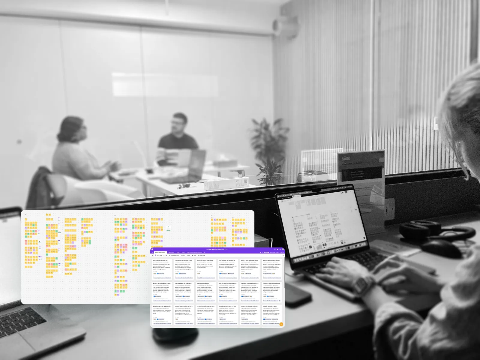
Making the findings accessible
This amount of research created a lot of data. To make it easy to digest, we built and co-authored the 3DS UX guidelines. What was once trapped in PDFs was now brought to life with easy navigation and interactive prototypes.
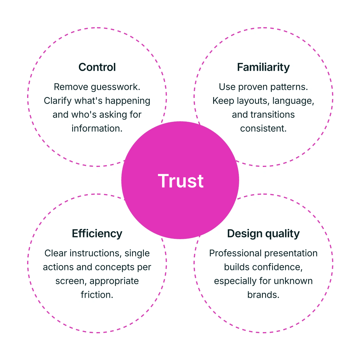
Key Insight
Balancing friction with efficiency can increase conversion, especially when security is top of mind.
4 data-backed pillars that impact trust: